Promotional Design Mistakes to Avoid to Prevent a Bad Logo Design
We've all seen egregious examples of bad logo design. From the London 2012 logo to eBay's husk of an emblem, some logos just look bad. Either they're ugly and memorable for all the wrong reasons or they're just dull.
Bad logos can make your business look so much worse, so much less professional. Yet if you're not a graphic designer, you might not know the rules of logo design. How are you supposed to know which logos will speak well of your business?
That's where we come in. We're specialists in designing tasteful, good-looking signs and badges for businesses, with a lot of happy customers. In this bite-sized article, we've assembled a list of logo fundamentals to help you avoid common logo mistakes.
Are you ready to make your branding better? Ready to have a sign that attracts customers? Then read on!
Don't Make a Logo Too Complex
One of the worst things that you can do when designing a logo is to make it too intricate. A complicated logo might look sophisticated when it's hung above your door, but you must ask yourself: what is the purpose of a logo?
A good logo is an example of fantastic visual branding that helps your customers remember your store. If you make your logo too complicated, it can't be recognized as well, which means that it won't serve its primary purpose.
You need to remember that your logo won't always be full-sized, either. Sometimes it'll be shrunk down to go on bags or receipts. A complicated logo doesn't work at these smaller sizes.
Keep it simple!
Don't Use Too Many Fonts
It can be tempting to want to stylize one word in your logo to make it look better. Maybe the word "artisanal" should be a fancy handwritten font, for instance? No, it shouldn't.
You can use whatever fonts you want when you're making your logo but you shouldn't mix and match them. As we said, keep it simple: one of the tenets of lousy logo design is to have a car crash of fonts on your logo.
At a maximum, use two fonts on your logo. If possible, keep it to one.
You should also bear kerning in mind, which is how your logo spaces its letters. Inadequate spacing can have disastrous results. The more fonts you have, the more likely it is that you'll have kerning issues.
Your Logo Should Be Versatile
When you're working out how you want your logo to look, you might have an idea in mind of it being in a specific location. Maybe you're picturing it on the sign above your door, painted on your window, or somewhere else. The thing is, you need your logo to work on all of these and more.
Your logo needs to be recognizable at any size, as it's going to be the primary way that people remember your business. This is why bad logo design is so terrible: it doesn't just look ugly, it doesn't help people remember your business.
Make a design that people will be able to recognize as yours whether it's on a box, coupon, crate, vehicle, or building.
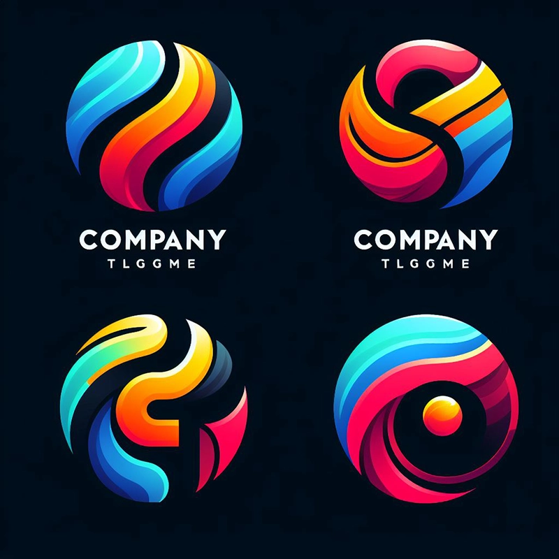
Ignore Current Trends in Logo Design
Trends come and go. Ignore them. If you design your logo around what's hot now, you're condemning it to be a mediocre logo later on.
It's like adding a use-by date to your logo. Instead of using something that's the new hotness, stick with something timeless.
When you think about famous logos, what springs to mind? McDonald's, Nike, Ford? All of these companies have stuck with their logos across the decades because they look plain good.
If you pick a tasteful logo, you won't need to change it. If you choose one that relies on the latest trends, you will.
Take Influence But Don't Copy
It's fine to take influences from other company's logos. Whatever you do, don't go and copy their logo.
There are a whole host of reasons not to do this. Firstly, it could land you in legal hot water. Yet it also demeans your business' branding.
You want a unique logo. If your logo is a copy of another, more well-known logo, it's going to make your customers think of that business and not yours. That defeats the whole object of having a logo as well as breaking one of the moral rules of logo design.
Use Colors Wisely
If you use too many bold colors, your logo is going to be hard to decipher. Sure, it's colorful, but if it takes too long to solve what it means, you've already entered bad logo design hell. Instead of using a lot of bold colors use two or three contrasting colors to make the various elements of your logo pop.
This helps make your logo more legible and more easily understood by your customers, which is precisely what you want.
Don't Go For Amateur Designers
We've all got to start somewhere but you should never have your logo designed by an amateur. There is a lot more to graphic design than we've covered on this post and only professionals such as ourselves will know what separates a bad logo from a good logo.
An amateur may be cheap, but if you have to pay them, then get it redesigned later by a professional, you've increased your costs! If you have to reprint a lot of different materials or have your store repainted, that's even worse.
Make the right decision and go for a professional from the start.
Avoid Bad Logo Design by Choosing Us
If this logo design business is starting to sound too complicated, then you're in luck, because we can help you. We're experts in logo design and can make a logo that complements your business' aesthetic and helps customers recognize you.
Avoid bad logo design and choose us—you won't regret it! You can take a look at our products here. If you have any questions, then please get in touch with us.


